SPOILER ALERT: Reading this article in advance might impact your actual Coinwink Matrix experience and you’ll receive a lower level of satisfaction. Similarly, like someone spoils a movie for you by telling how it ends.
That is why we strongly suggest first to experience the Matrix, and then return here to read the article.
In your Coinwink account, switch from Classic to Matrix, and you’ll see how deep the rabbit hole goes.
Or if you are in a hurry, take a quick look at the demo Portfolio with the Matrix theme that doesn’t require the account.
The CSS Wonderland
During the last month, a lot of front-end updates were made for Coinwink.
The previous CSS styles file was a big mess. Started almost 4 years ago, many styles were inlined or randomly smashed together with !important overwrites and without a structure.
To fix such a chaotic styles file it takes quite a lot of time. These are little fixes but they are time-consuming, and when they’re done, it seems that nothing has changed. Why so?
Because the changes are behind-the-scenes. For example, a bigger invisible click/tap area for buttons. The user doesn’t see or think that there is a difference, but she feels it intuitively.
“What you know you can’t explain, but you feel it.”
― Morpheus
All together, these little changes create a slick and smooth experience and make the web-app feel more like a native app.
What are these app-like changes, you might ask?
- Disable zooming on mobile devices
- Disable text/element selection on mobile devices
- Create bigger invisible touch areas for clickable elements
- Separate :hover and :active states on desktop and mobile devices
- Minimize flickering
- App icon for mobile devices, web app manifest, theme color etc.
- Create custom form elements (inputs, drop-downs, buttons, checkboxes, etc.) with consistent style across all browsers
- Styling scrollbars
And a few more tweaks here and there. Some of these things are implemented “out of the box” in most CSS frameworks, but Coinwink is not using a framework because similar frameworks often result in generic feel or enforce a specific style, and also increase the size of the app more than the custom CSS.
Additionally, during the recent updates, significant structural front-end changes were made. When looking from the outside, they are also invisible.
The new structure allows us to easily change styles, build new front-end features, and we can now create themes.
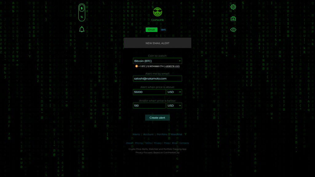
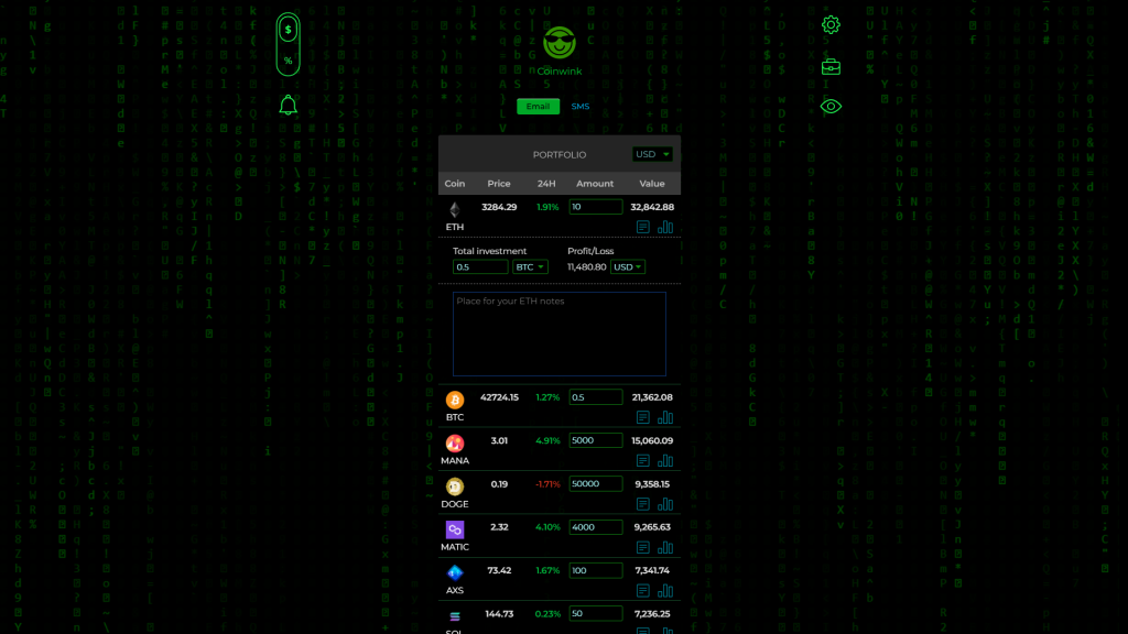
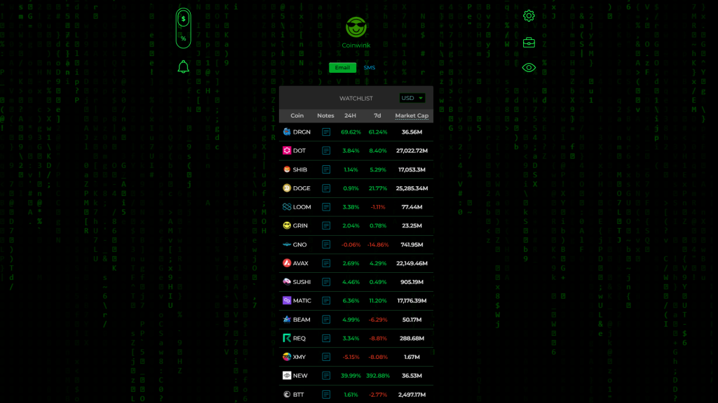
Introducing the new Matrix theme
The first theme built on the new Coinwink front-end structure is the Matrix.
“The Matrix is everywhere. It is all around us. Even now, in this very room.”
― Morpheus
From the conceptual point of view, the Matrix is another dimension of reality, or a simulation (if the reality itself is not a simulation). The concept has deep meanings across different cultures, and this infuses the Matrix theme with the story and symbolism.
“You take the red pill—you stay in Wonderland, and I show you how deep the rabbit hole goes.”
― Morpheus
A switch to Coinwink Matrix theme is animated and not instant. It creates the effect of a transition into a different dimension.
To experience the Matrix, switch the theme in your Coinwink account.


Similar to other recent updates, Coinwink Matrix theme is extremely lightweight. When activated, it adds only around 20KB of size.
It’s the first theme – a showcase of new possibilities. The dynamic background is now probably too active, so in the near future, it will be possible to turn it off or make it less prominent.
More themes are planned for the future.

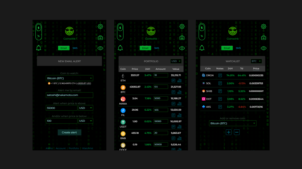
Above are presented Coinwink app mobile views. Coinwink works equally well on both desktop and mobile devices.
The Coinwink source code, including the Matrix theme, is available on our GitHub.
As usual, your feedback is appreciated!
Let us know what do you think about the new Matrix theme? What other themes and features you’d like to see in the future?
